

Guaranteed Mobile & Tablet Compatibility:
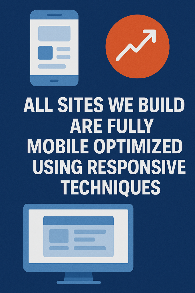
- Responsive Design
- The redesign will use flexible grids, images, and media queries to automatically adapt to any screen size (iPhone, Android, iPad, etc.).
- No more pinching/zooming—text, buttons, and menus will resize perfectly.
- Mobile-First Approach (Best Practice)
- Many studios (including Wemaxa, if they follow modern standards) design for mobile first, then scale up to desktop. This prioritizes the growing majority of mobile users.
- Touch-Friendly Features
- Larger buttons, streamlined menus (like hamburger icons), and optimized forms for touchscreens.
- Performance Optimization
- Faster loading on mobile networks (compressed images, lazy loading).
- Google’s Core Web Vitals (a ranking factor) will be addressed.
- Cross-Device Testing
MORE LINKS:
What is web design?
Responsive website?
Do I need a website?
How long design takes?
Design vs development?
Website redesign
Template vs custom
How much it costs?
Good domain name?
WILL MY WEBSITE WORK ON A SMARTPHONE?
If we at Wemaxa.com redesign your website, ensuring it works flawlessly on smartphones and tablets will be a core priority. In today’s digital landscape, the majority of users browse on mobile devices, so your website must adapt seamlessly to various screen sizes. A responsive design isn’t optional it’s essential for delivering a smooth, frustration-free experience that keeps visitors engaged no matter how they access your site.
Our redesign process includes mobile-first thinking from the start. We don’t simply shrink the desktop version to fit smaller screens we optimize layouts, images, buttons, menus, and touch interactions specifically for smartphones and tablets. Everything from navigation to loading speed is tested and tailored to provide the best possible experience for mobile users.
We also take performance seriously. Mobile users often browse on slower connections, so we focus on fast load times, clean code, and lightweight assets that won’t bog down their experience. Features like tap-friendly buttons, streamlined forms, and simplified content structures help keep things accessible and efficient on the go.

Ultimately, a site that works flawlessly on mobile does more than look good it performs better in search engines, converts more users, and builds greater trust. When Wemaxa.com redesigns your site, mobile responsiveness isn’t a feature it’s a foundational standard.
How to Confirm This Before Hiring Us:
- Ask us for examples of past responsive redesigns in our portfolio.
- Request a mobile-friendly mockup during the design phase.
- Check their contract for terms like “responsive design” or “mobile optimization.”
Post-Redesign Checks:
- Test your site yourself using:
- Google’s Mobile-Friendly Test
- Real devices (ask friends/family to try it).
Pro Tip: If your current site isn’t mobile-friendly, a redesign could boost conversions and SEO rankings significantly!