Wemaxa brand identity studio
Build a brand people recognize, remember and trust.
We create brand strategy, visual identity, logo systems, messaging and digital experiences that make every customer touchpoint feel connected and unmistakably yours. The result is more than a polished logo: it is a recognizable system your team can use across websites, campaigns, presentations, products and everyday communication without reinventing the brand each time.
A system, not
just a logo.
Clarity before decoration
A visual identity built around what makes you different.
Branding is the complete experience people associate with your business. Wemaxa connects positioning, message and design into a practical system your team can use consistently across websites, products, campaigns, social media and sales materials. We establish the strategic idea behind the identity first—who it is for, what it should signal and why it should be remembered—then turn that direction into visual and verbal rules that remain coherent as new channels, products and teams are added.
Positioning
Define the audience, competitive space and distinct value your brand should own in customers’ minds.
Visual identity
Create a flexible logo, color, typography and imagery system designed for recognition across every format.
Voice & story
Shape a clear personality, narrative and messaging framework that people can understand and remember.
Brand experience
Translate the identity into interfaces, campaigns and customer moments that feel consistently intentional.
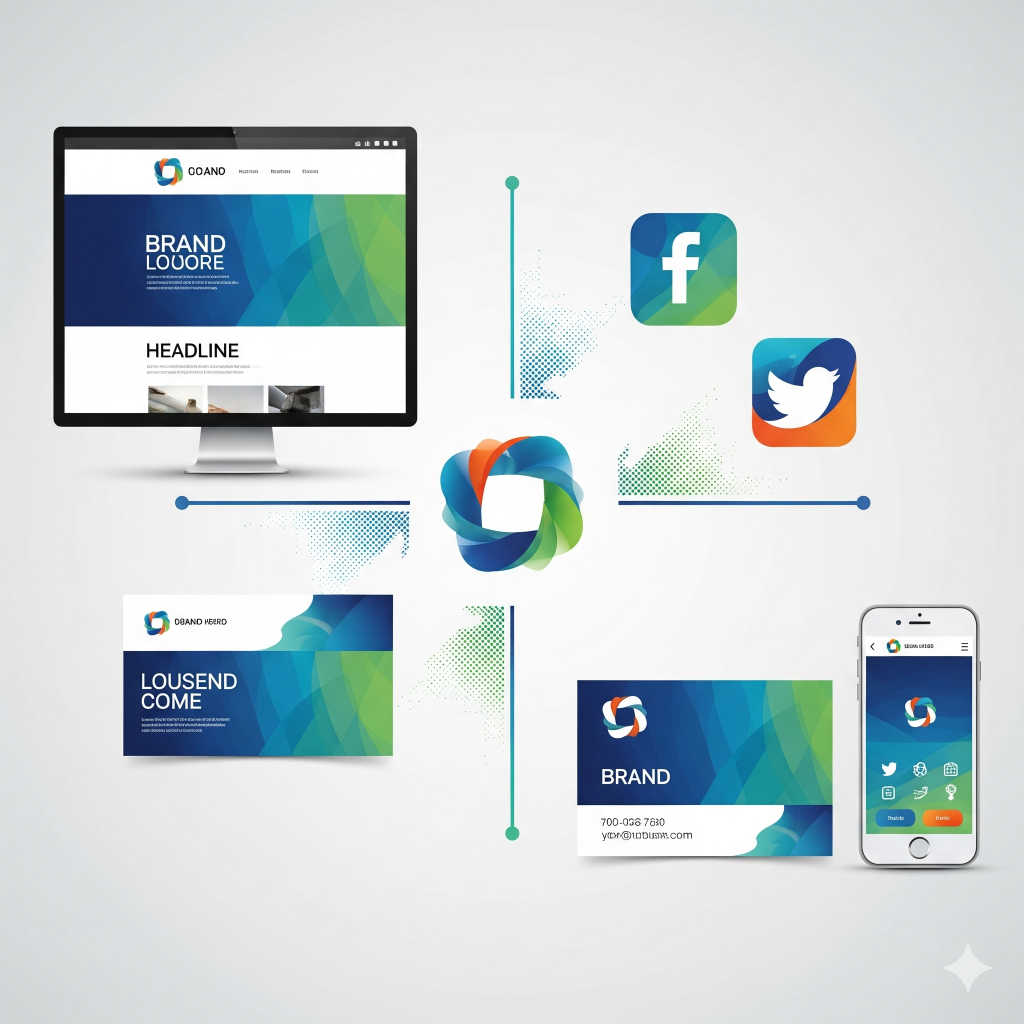
Identity that works everywhere
Distinctive at a glance.
Consistent at every scale.
A successful identity must work on a tiny app icon, a responsive website, a campaign, packaging and everything still to come. We design reusable rules—not isolated graphics—so new applications remain on-brand without slowing your team down. Responsive marks, typography hierarchy, color roles, imagery direction and layout principles are designed together, giving internal teams and future partners enough structure to move quickly without gradually diluting the identity.
Different markets. Different visual signals.
Six brand directions built for six different industries.
A strong logo should feel appropriate to its market without becoming a cliché. These concepts show how Wemaxa can shift geometry, typography, color, tone and symbolism while keeping every identity simple enough to work on websites, apps, social profiles, signage and printed material. Each direction begins with the same practical test: the mark should be distinctive at a glance, readable at small sizes and flexible enough to support a complete visual language rather than functioning as an isolated symbol.
Real estate identity
A structured architectural mark for premium property, development and brokerage brands. The geometry suggests a roofline, skyline and forward movement without relying on a literal house icon.
Healthcare identity
A softer clinical system built around care, continuity and trust. The symbol combines a protective ring with a simple pulse path to feel modern without becoming cold or pharmaceutical.
Education identity
A progressive learning mark based on layers, growth and knowledge in motion. It works for schools, academies, training platforms and education technology without looking childish.
Private business identity
A restrained monogram for consulting, investment, family business and specialist firms. The identity feels established and discreet while still translating cleanly into contemporary digital interfaces.
Hospitality identity
A warm destination mark with a simple horizon and sun motif. It is intentionally elegant enough for a boutique hotel, private resort or premium hospitality group without becoming overly ornate.
Technology identity
A modular network mark for AI, automation, software and data businesses. The symbol can break apart into icons, favicons and interface details while keeping a recognizable core geometry.
The Wemaxa brand process
From insight to a usable identity.
Each phase resolves a different business question, turning research into a brand system that is easy to recognize, explain and deploy. Discovery clarifies the market and audience, positioning defines the idea the brand should own, design translates that strategy into a distinctive identity, and activation gives your team the rules and assets needed to use it consistently in real work.
Complete brand toolkit
Everything needed to stay coherent as you grow.
Choose a focused identity engagement or connect branding with Wemaxa web design and digital product work for one continuous customer experience. The toolkit can cover logo families, typography, color, imagery, messaging, brand architecture, digital templates and usage guidelines—giving teams a shared reference for everyday decisions while leaving enough flexibility for the brand to evolve across new products, markets and campaigns.
Logo systems
Primary, secondary, responsive and icon marks prepared for digital and print use.
Brand guidelines
Clear rules for logo use, color, typography, imagery, layout and accessibility.
Messaging framework
Positioning, value proposition, voice principles, taglines and proof points.
Digital applications
Website direction, social templates, email, presentations and campaign assets.
Brand architecture
Organized relationships between the parent brand, products, services and sub-brands.
Brand evolution
Audits, refinements and scalable systems for new markets, products and channels.
Ready to make your brand unmistakable?
Let’s create the strategy and visual system behind a stronger digital presence—one that is easier to recognize, easier for your team to use and consistent from the first impression through every future customer touchpoint.