

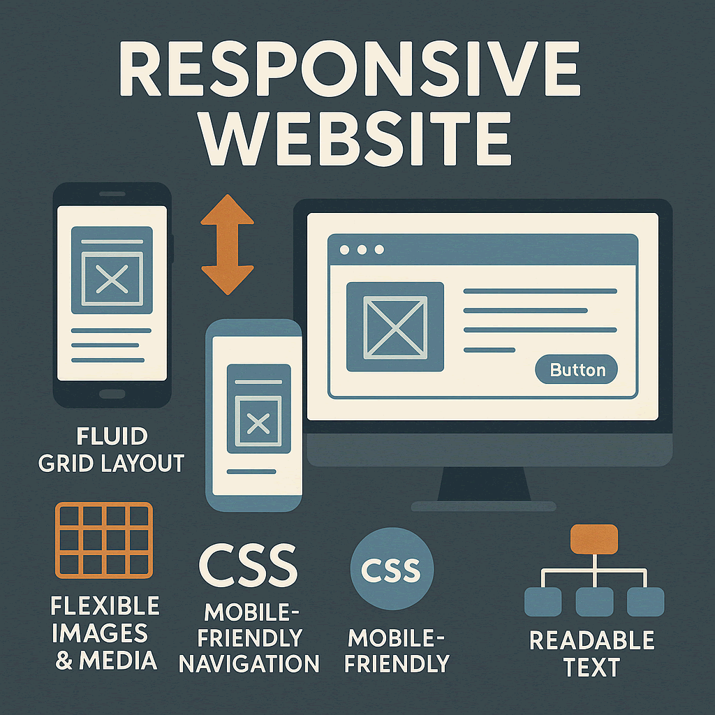

Features of a Responsive Website:
- Fluid Grid Layout: Uses relative % units instead of fixed pixels to resize elements.
- Flexible Images: Scales images and videos to prevent distortion or overflow.
- CSS Media Queries: Applies styles based on screen width, orientation, or resolution.
- Mobile-Friendly Navigation: Simplifies hamburger menus for smaller screens.
- Readable Text: Adjusts font sizes and spacing for better readability on all devices.
Why Responsive Design Matters:
✔ Better User Experience (UX): No zooming or horizontal scrolling.
✔ Improved SEO: Google prioritizes mobile-friendly sites.
✔ Lower Maintenance: One site for all devices (no separate mobile version).
✔ Higher Conversion Rates: Users stay longer on easy-to-use sites.
Example:
- Desktop: Multi-column layout.
- Tablet: Simplified two-column design.
- Mobile: Single-column stack with larger buttons.
Ultimately, a responsive website means much more than fitting content neatly on different screens. It symbolizes respect for the user, alignment with global standards, and commitment to accessibility. It shows that a brand has understood the evolution of the internet and has chosen to meet people where they are. In competitive digital markets, these small details create the difference between being discovered or being forgotten. The meaning of responsiveness, therefore, is not technical alone it is cultural, strategic, and deeply tied to how modern communication unfolds on the web.
MORE LINKS:
What is web design?
Do I need a website?
How long design takes?
Design vs development?
Website redesign
Mobile friendly?
Template vs custom
How much it costs?
Good domain name?
WHAT IS A RESPONSIVE WEBSITE?
A responsive website is a site that automatically adjusts its layout, images, and content to fit different screen sizes and devices, providing an optimal viewing experience whether accessed on a desktop, tablet, or smartphone.
What does a responsive website mean?
When the term responsive website is mentioned, it refers to a design philosophy where a website adapts seamlessly to the screen size and device it is being viewed on. Unlike older static websites that were rigid and often displayed poorly on mobile devices, responsive web design ensures that layouts, images, and navigation elements automatically adjust to provide an optimal experience. This concept became a turning point in digital design after the rise of smartphones and tablets, creating a need for web pages that could serve users equally well on large desktop monitors and small handheld screens. For a deeper understanding of its foundations, the principles of responsive web design provide valuable insight into how fluid grids, flexible images, and media queries changed the internet.
From a practical perspective, a responsive website is more than just a technical adjustment. It represents a shift in how businesses and creators approach their digital presence. A company that invests in responsive design signals that it values accessibility, usability, and professionalism. Visitors arriving from a desktop computer expect the same level of polish as those arriving from a smartphone, and failing to meet this expectation can lead to frustration and abandonment. Google itself recommends responsive design as the preferred approach for mobile SEO, meaning that the technical structure of a website has a direct influence on how it ranks in search results. By aligning both user experience and search engine best practices, responsive websites achieve a rare balance of functionality and visibility.

The mechanics of responsiveness involve a mix of technologies. At the heart are CSS media queries, which allow designers to apply different styling rules depending on the device’s width or orientation. Combined with flexible grid systems that use percentages instead of fixed pixel values, this ensures elements resize proportionally rather than breaking the layout. Images are also set to scale dynamically so that they remain crisp without overwhelming the screen space. This modular approach creates a design framework that feels fluid, as though the website is alive and reshaping itself to suit the visitor’s context.
Yet the meaning of responsive design extends beyond just aesthetics. It represents inclusivity in digital communication. With billions of people accessing the internet through mobile-first connections, a site that fails to respond properly is effectively excluding entire audiences. The majority of global web traffic now originates from mobile devices, making it irresponsible to design with only desktop users in mind. For businesses, this is not simply about being modern, it is about survival in a landscape where consumer attention spans are limited, and alternatives are just one tap away.
Responsiveness also intersects with performance. A truly responsive website is not just visually adaptive but optimized for speed. Heavy scripts, oversized images, and poorly structured layouts can slow down load times on mobile data connections. Since speed is a ranking factor in search engine algorithms, responsiveness must also incorporate efficiency. Techniques like lazy loading images, compressing resources, and using modern web standards enhance both usability and SEO value. By treating responsiveness as a holistic discipline, websites can avoid the pitfalls of being beautiful but sluggish.
The strategic value of a responsive website lies in its ability to future-proof a brand’s online identity. Technology evolves rapidly, and new devices with varying resolutions and screen ratios appear constantly. Instead of designing for every possible screen individually, responsiveness creates a framework that scales universally. This adaptability saves businesses from frequent redesigns and ensures that their digital investments remain relevant as technology progresses. In this sense, responsiveness is not only a design trend but a long-term strategic decision.