Key Takeaway
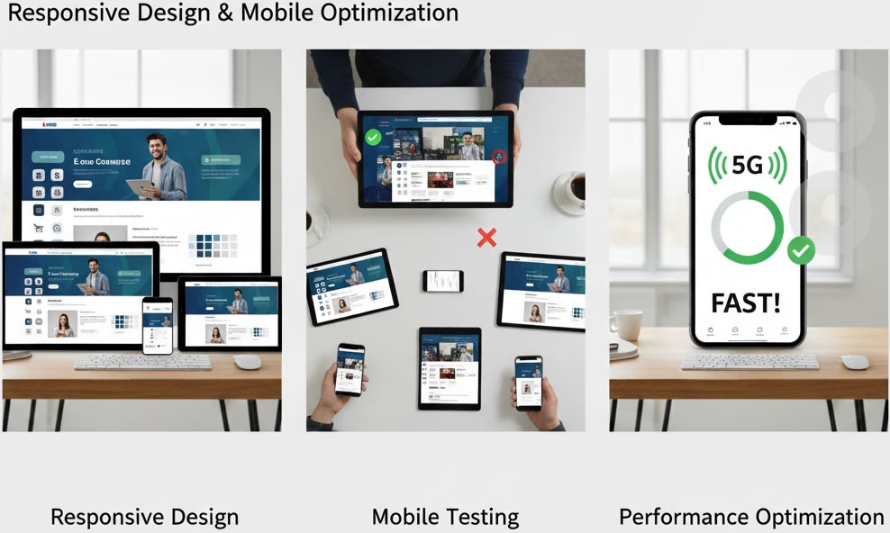
Most professional designers/developers default to responsive design but always confirm to avoid surprises. If mobile traffic is important (and it usually is!), insist on:
✅ Responsive design (not desktop-only).
✅ Mobile testing (on multiple devices).
✅ Performance optimization (fast loading on 5G/6G).
How to Guarantee a Mobile-Friendly Site
- Include in Contract: Specify “fully responsive design” as a requirement.
- Check Their Portfolio: Look for mobile-friendly examples in their past work.
- Test Before Launch: Use Google’s Mobile-Friendly Test or view the site on your phone.
Alternatives (Older Approaches)
- Dedicated Mobile Site (e.g.,
m.example.com): Rare today (harder to maintain). - Mobile Apps: Separate from the website (costs more, needs app store approval).
MORE LINKS:
Front end includes?
Seo optimized design
Technology for frontend?
Match existing branding
I need animations?!
How long it takes?
Preview the design
Provide source files
Typical includes
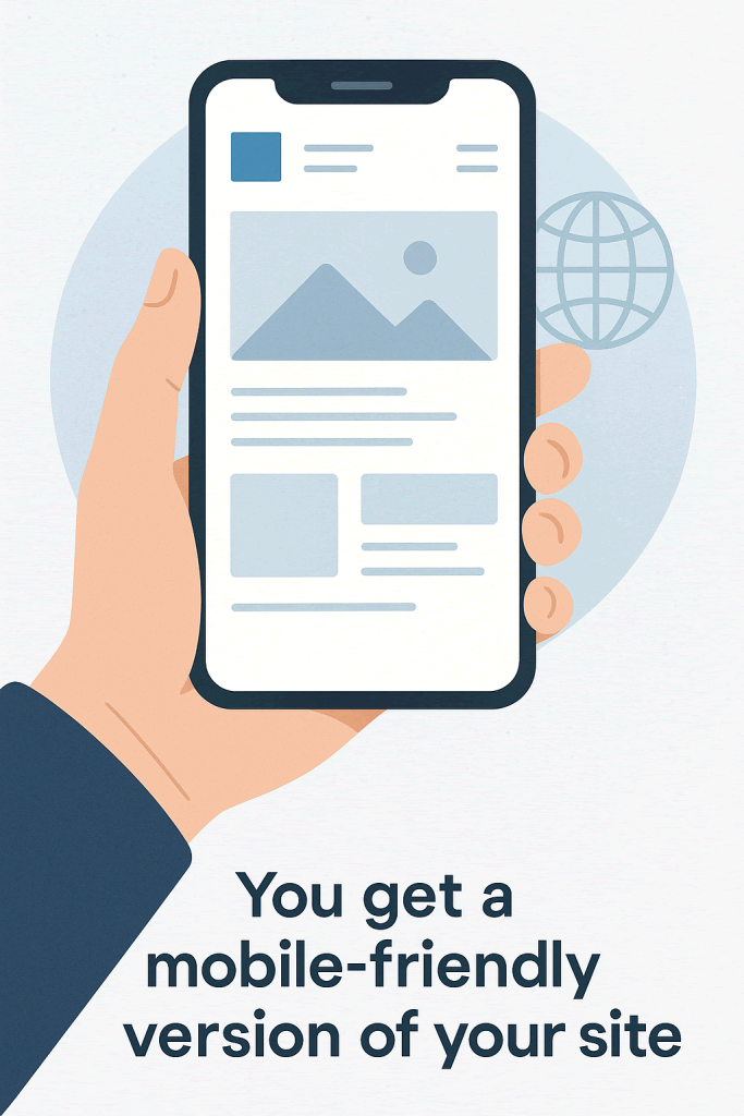
DO I GET A MOBILE WEB DESIGN?
Whether your website is mobile-friendly depends on how clearly you communicate your needs to the designer or developer. Many people assume this feature is automatic, but unless it’s requested and planned from the beginning, it may be overlooked or only partially implemented. A mobile-friendly website adjusts its layout and functionality to fit smaller screens like phones and tablets, allowing visitors to browse, read, and interact with ease. Without this consideration, users may face difficult navigation, unreadable text, or slow loading times, which can lead to frustration and higher bounce rates.
To make sure your site works well on all devices, ask specifically for a responsive design. This approach uses flexible layouts, scalable images, and smart styling to ensure your content adapts automatically to any screen size. Responsive design is the standard across platforms like WordPress, Shopify, or custom-built sites, but it still needs to be tested and fine-tuned. Good mobile design includes clear navigation, touch-friendly buttons, readable fonts, and minimized loading delays all of which contribute to a smoother user experience.
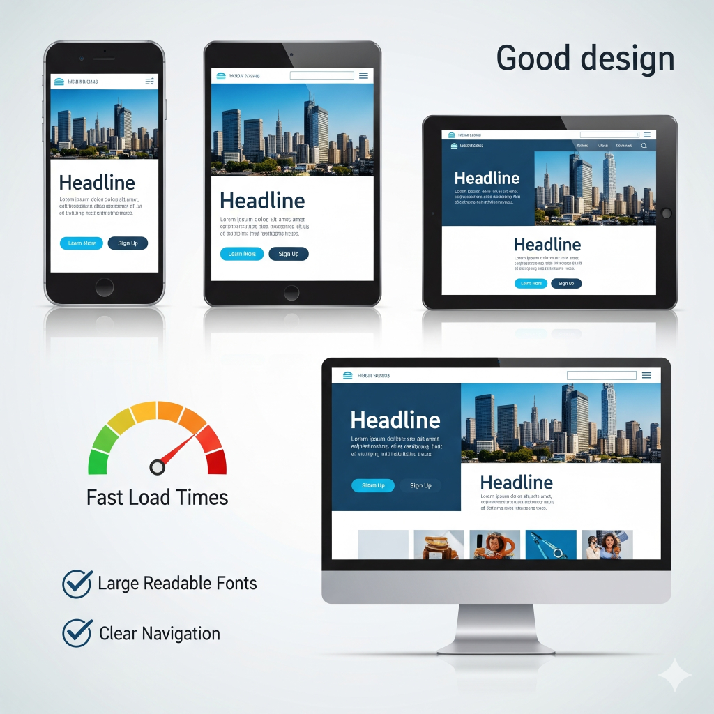
It’s also helpful to preview the mobile version of your site during development. Ask for mobile mockups or test versions that show how your content behaves on different screen sizes. This way, you can give feedback early and catch issues before launch. A strong mobile presence not only improves usability, but it also boosts your credibility and ranking on search engines. Whether your visitors are browsing on the go or shopping from their phones, a mobile-optimized site ensures they stay engaged and get the best impression of your brand.
1. Not Automatic (Unless Specified)
- A basic website design might only work well on desktops unless the designer explicitly includes responsive design (adapting to mobile screens).
- Always ask upfront if the service includes mobile optimization.
2. What You Should Request
- Responsive Design (Standard Practice):
The site should automatically adjust to phones, tablets, and desktops (no separate “mobile version” needed).
(Example: Menus collapse, text resizes, images scale down.) - Mobile-First Design:
The designer starts with mobile layouts first, then expands to desktop (better for performance and UX). - Testing on Real Devices:
Ensure they test on iPhones, Android phones, and tablets.
3. What Happens If You Don’t Ask?
- You might get a desktop-only site that looks broken or requires zooming/scrolling on phones.
- Mobile users could have a poor experience (high bounce rates, lost sales).